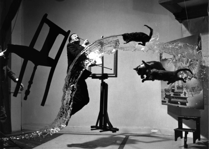
When in need of a logo, some business owners sit at their desks for hours trying to think of an original idea, others turn to experts, and some even ask for renowned artists like Salvador Dali.
Truth is, trying to find an appropriate design to fit the brand, radiate its values and be applicable to lots of mediums is challenging. Sadly, a few hours don’t quite cut it; you have to know and feel the brand, find inspiration, do the work, sketch, draw or model the design, etc.
There are a lot of steps, but it all starts with knowing what you are looking for and being inspired. So, here are a couple of interesting design cases to get you there.
Chupa Chups logo by world-known artist
Chupa Chups was founded in 1958 by Enric Bernat, who got the idea of the sweet on a stick by seeing how regular sweets were uncomfortable to eat. Children, who were the main consumers of sweets, regularly got their hands sticky, so the stick solved that problem. The lollipop was named after the Spanish verb “chupar”, which means “to suck”.
In 1969, after 10+ years of being in the market, the Chupa Chups decided to change its logo. At that time, the Spanish confectionery brand had changed its logo 3 times before settling on the design created by world-renowned surrealist Salvador Dali. Today’s design is a really close version to the 1969’s logo, just with a couple of tweaks.
The designed logo contained the Chupa Chups name inside a bright yellow daisy shape. The font and its color did not differ from the previous logo (1963–1969), yet the yellow daisy-shaped image was a turn that was never done before. It leaned into the playfulness of the brand, giving the consumer the feel of picking flowers when holding the lollipop in his hand. After Salvador Dali’s suggestion, the logo was placed on top of the lollipop to be visible as intact at all times. This corresponded to the second part of the slogan of the marketing campaign “It’s round and long-lasting”, which premiered with the new logo.
How did it change over time? It almost didn’t.
The re-imagined logo, presented to the public in 1990, contains a similar curly font with joined-up writing and the same 8-leaf yellow daisy. The colors of today’s logo are more vibrant and attention-grabbing and include an additional shade of muddy yellow and white as the layers of the border of the daisy shape. It’s a modern take on the historic brand design case, that keeps the light-heartedness but is even more memorable than before.
Even if you don’t particularly love sweets, you certainly know the famous sweet on a stick brand and its eye-catching logo.
The Nike logo was created by a graphic design student.
Yes, you heard it. One of the most influential brands in the world has a logo that was created by someone still in university, but the design is truly fitting.
Founded in 1964 as “Blue Ribbon Sports” by two track athletes, Bill Bowerman and Phil Knight, the brand initially operated as a distributor for Japanese shoe maker Onitsuka Tiger. One of the co-founders, Bill Bowerman, was passionate about running shoes and seeing that the ones on the market had their flaws, was determined to correct them. Seven years and many attempts to create a perfect running shoe later, in 1971, Nike was introduced.
The “Swoosh” – the check mark or, as some people say, the comma – was created that same year by graphic design student Carolyn Davidson. She was asked to provide a design that was similar in style to the Adidas brand and inspired consumers to be active. Carolyn created a few designs, yet the “Swoosh” was a clear winner: elongated shape without fill with the name written on top of it, reminiscent of the Greek goddess of victory, Nike, and the shape of her wings. In ancient Greece, her wings gave courage to the fighters, thus such a symbolic emblem was meant to give the same courage to the athletes when seeking victory.
It is said that Phil Knight was not completely sure about the logo, but he didn’t have a budget to change it. It may be why the company paid Davidson only 35 dollars for creating the Nike logo.
But being a “team-first” company comes with responsibilities. One of which is having ethical labor practices.
So, when Nike was successful enough to enable founders to pay more than a few bucks for its well-known logo, they “just did it”. In 1983, during the company executive dinner, Davidson was given a gold diamond ring with a “swoosh” engraved to the band and 500 shares of stock. Since then, the stocks must have tripled in value.
Later the font was changed, and the shape was filled with black color. In 1995, Nike removed its name from the logo, but the main idea persisted – it encouraged people to move their bodies, achieve great results, support each other, and create a community that favors the brand’s values.
Do you feel inspired now? Need more help regarding logos? Remember, the process of logo creation has certain rules, and trends you might want to jump on, so trusting the task to professionals (us) is the easiest way to go.

